
How to choose brand colours that actually work
Bugufi Studio
10 Jul 2026
4 min read
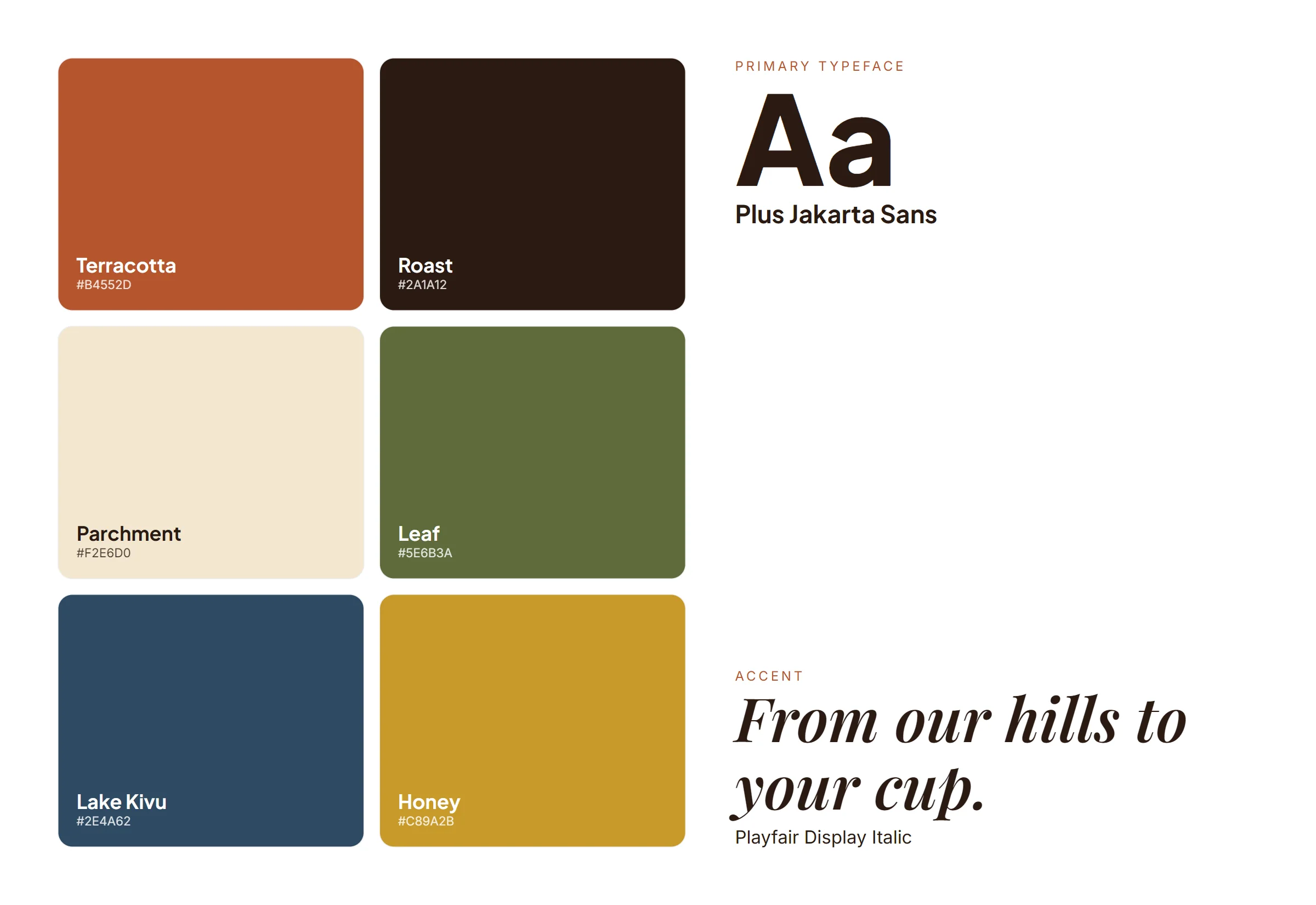
Colour is often the first thing people remember about a brand. Yet many palettes are chosen in a meeting based on personal taste. Here is a better way.
Look at your competitors first
Line up the logos of your five closest competitors. If they are all blue, blue will make you invisible.
Give every colour a job
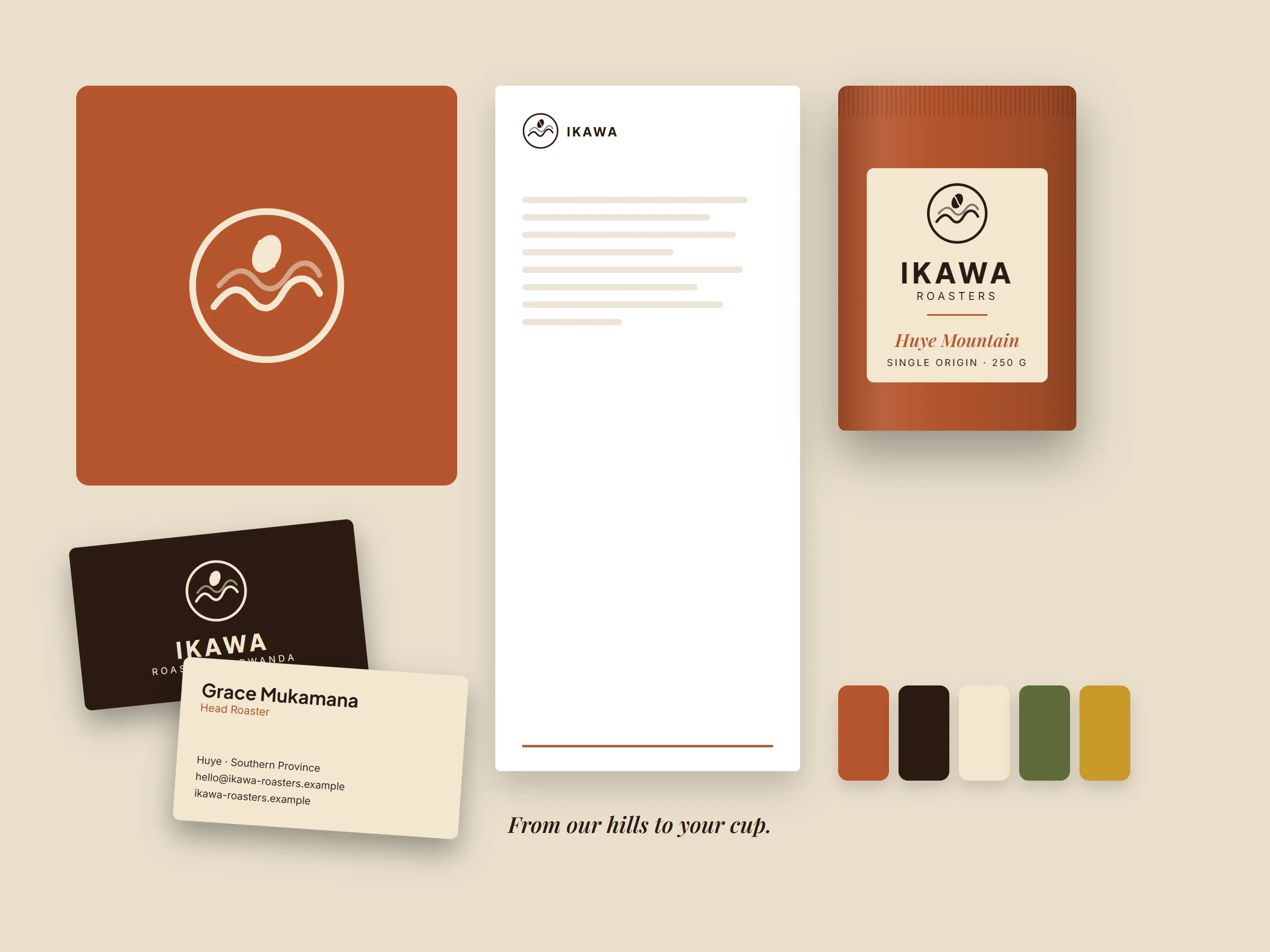
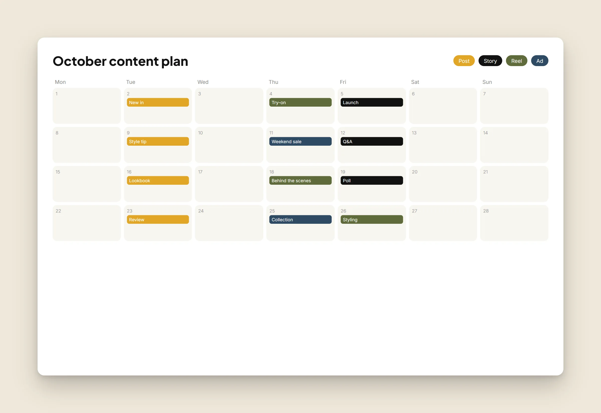
- One main colour people will associate with you
- One accent for buttons and highlights
- Neutrals for text and backgrounds
“If every colour has a job, your brand stays consistent.”
Finally, test your palette where it will live: on a phone screen in sunlight, on a printed flyer and on a shop sign.

Keep Reading
Your logo is not your brand (and why that is good news)
Branding · 18 Sept 2026Consistency beats virality: a realistic social media plan
Social Media · 04 Sept 2026Leave a Comment
Questions or ideas about this article? Your message goes straight to our team.